Context of the project
The client of the story: Ancon, wanted to come up with a comprehensive re-design for their food ordering platform which is already using by 400+ tenants (Restaurants & bars).
Outdated UI and poor user experience, were the main reasons behind this complete revamp. Because these 2 main reasons are the blockers to increasing more restaurants get on board and more users.
Starting with client calls
I initiated the project with client discussions, focusing on understanding the reasons for the application redesign and assessing its current status
Because the cruciality of getting the exact requirement of the client, about an application which is already in use, I conducted a few rounds of discussions with clients with the help of BA and PM, and we came across the main idea behind the redesign.
The need for a comprehensive app redesign primarily arises to address outdated designs and improve user experience in order to drive more users, And also to improve overall functionality, facilitate white label support and streamline the overall user journey
Defining the problem
Following the initial discussions with the client, I have defined the core problem of this new design requirement
The poor user experience and outdated user interface designs are obstacles preventing the expansion of customer base and impeding efforts to onboard more restaurants as tenants onto the platform.
Clarifying the parts of my task
Based on the discussions, revamp not just the UI, but also to elevate overall user experience of the application was my task to complete.
I was tasked with enhancing the overall user experience, which involved addressing all usability and other UX-related problems within the application.
Subsequently, I was responsible for doing a comprehensive UI design overhaul for the application.
Analysing the current application
As the initial step, before engaging with the client, BA, or the team, I began by reviewing and analysing the application to familiarise myself with it.
So I decided to do an in-depth analysis of the designs, user flows, functionalities, information architecture and interactions in the application.
Key things identified that needs to be improved in the overall application are,
Gathering insights from the current users
As the next step I straightly moved to have a look at feedbacks from the existing users. For that I actually used two approaches,
1
Information through existing customer inquiries
2
Daily & infrequent user interviews ㅤ
1st Approach: Information through existing customer inquiries
So I initiated the 1st approach by contacting the customer support team of the ancon, to get information regarding inquiries from customers about the application's user experience. I also considered some of the technical inquiries, as they can directly impact the application's user experience.
Key takeaways are,
2nd Approach: Daily & infrequent user interviews ㅤ
Then with the help of the client and the team, I conducted some user interviews. We got involved users vary from daily active users to infrequent users to understand what motivates or demotivates them from ordering food from our application.
Remote User interviews
Open-Ended Questions
Scenario Based Questions
I opted for an open-ended questionnaire approach, allowing users to respond freely in their own words. This method uncovers unexpected insights about the application flow.
Additionally, I incorporated scenario-based questions to explore specific user expectations in real-life situations, complementing my existing knowledge of areas that need addressing.
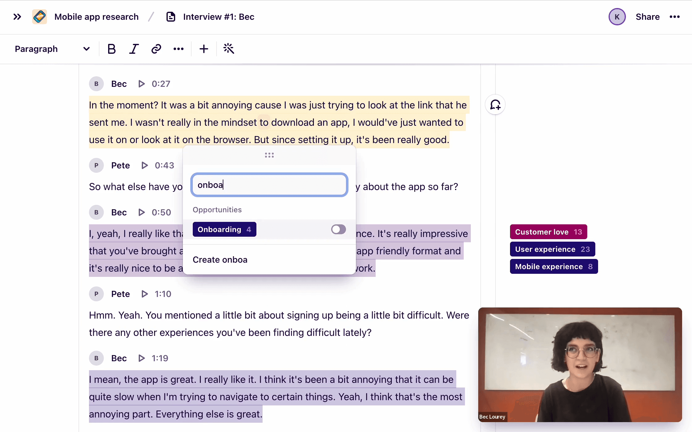
I used “Google Meet” as the meeting platform and then took all those interviews to “Dovetail” to organise and analyse all the data.
And some of the pain points raised were,
↑ Some of the pain points, raised
Follow-up usability testing
As a follow up step, for the user interviews, I conducted usability testing rounds with the same users. Additionally I recruited a very few users who were completely new to the application as well.
Remote Usability testing
Task Based
Think a loud testing
We used a combination of methods, involving both task-based testing where users worked on defined tasks and think-aloud testing where they expressed their thoughts, actions, and feelings. This approach provided more insightful feedback about the application from the users.
First I tasked them to, cover a overall flow, like
“How would you order, 2 Cheese burgers and, 1 Beef burger and also a latte, from the nearest Max outlet to you, and pay by Swish or Gift Card options ?”
Then I asked them to demonstrate few flow specific based tasks, like
How would you…
change the order type (Eat-in to delivery) when you are already in the middle of adding products?
search for restaurants in a specific area ?
add products to cart ?
change the delivery time ?
pay with card options ?
pay with a gift card or with your wallet ?
Organising all insights into an affinity map
Then as the next step, I organised the insights we gathered into an affinity map, allowing me to categorise findings under specific user flows. This helps me clearly identify the areas to focus on and begin my ideation process.
here is just a sneak peak of the affinity map
↑ Part of the affinity map
Ideating
Next, I just started to address every flow based scenarios and started to ideate the possible UI improvements and flow + functional changes in the application.
Ideating
Possible UI improvements
Application flow & functional changes
In this step, I alternated between using paper sketches and annotations and drawings of ideations on screenshots of existing application flows.
For scenarios where I wanted to maintain the current flow methods, I ideated directly on the existing application UIs. For areas where I had more creative freedom, I relied on paper sketches to generate ideas.
↑ An initial paper sketch
Wire-framing & evaluating
After sketches, as we usually do, I pick promising sketches and go over the details by creating the wireframes, after which I choose the best variant and work it out in greater detail. In this step with wireframes actually it's easy to discuss the solution with product owner team.
In some cases I tend to create wireframe level prototypes also, in order to identify the most optimum solution.
Starting to design
Defining the styles
Before diving into UI designs, as is my usual practice, I prefer to establish a preliminary style guide for initial direction. This guide acts as a foundation, evolving as the design process progresses.
Determining the necessity for a design system
We decided not to create a design system and instead focused on maintaining a UI element/component library for several reasons:
No Design System
but
UI Elements/Components Library
We decided not to create a design system and instead focused on maintaining a UI element/component library for several reasons
Fewer UI & interactions - Mainly having fewer unique UI components and interactions which doesn't need a complex design system
Working only one designer - As the sole designer, detailed collaboration guidelines within a design system weren't required. I could maintain consistency without extensive documentation.
Quick changes & modifications - Without a design system I can do rapid changes to just to the components, instead of changing a whole design system
Flexibility - Giving me the flexibility to make swift changes based on feedback, unrestricted by design system constraints.
Finalised UI Designs
Landing page - Centeredly positioned widget attracts more attention, given its crucial role in guiding the user's primary action and the page layout kept minimalistic, and the background image will be periodically updated.
↑ Home/landing page design
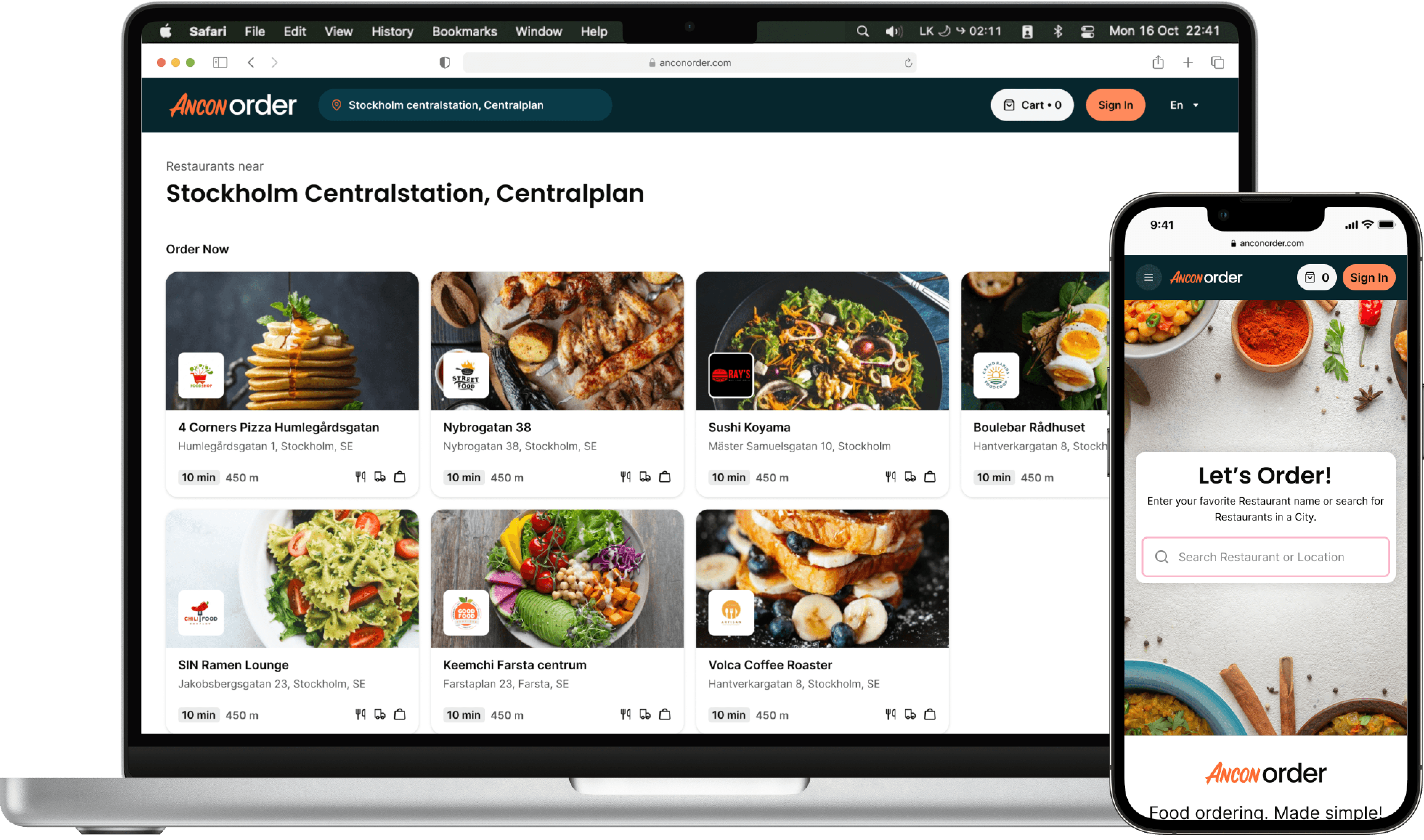
Outlet/Restaurant listing page - The newly added location widget and results title offer users flexibility in changing locations and refining searches & simplified outlet card improves visibility, showcasing cover images, logos, and information.
↑ Restaurant/outlet listing page
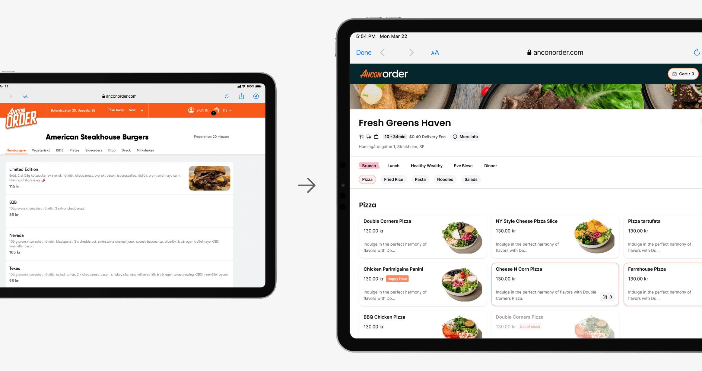
Restaurant Page - Menu structure was revamped to provide a clearer visualisation of levels and, the item card and layout were optimised to dynamically display more cards.
↑ Restaurant/Outlet page design
The Product Pop Up has been entirely redesigned into a vertical layout, featuring improved sectioning and highlighting essential details such as required selections and updated prices after modifications to product.
↑ Product pop-up design
Shopping Cart - The Cart has been transformed into a separate sliding or sticky panel (in larger screens), replacing the small sliding popover, allowing for product modifications directly within the cart.
↑ Shopping cart design
Interaction Example - Here's how the login option is integrated into the delivery address selection process.
↑ Encouraging to log-in, in address selection scenario
Interaction Example - Here's a rare scenario where selecting the available quantity from partially out of stock product.
↑ Option selection of product out of scenario
Interaction Example - Here's a rare scenario where selecting the available quantity from partially out of stock product.
Restaurant Page - Menu structure was revamped to provide a clearer visualisation of levels and, the item card and layout were optimised to dynamically display more cards.
↑ Restaurant/Outlet page design


